Streamlining processes at Pittsburgh COmmunity Food Bank
User Research, UI Design, UX Design, Service Design
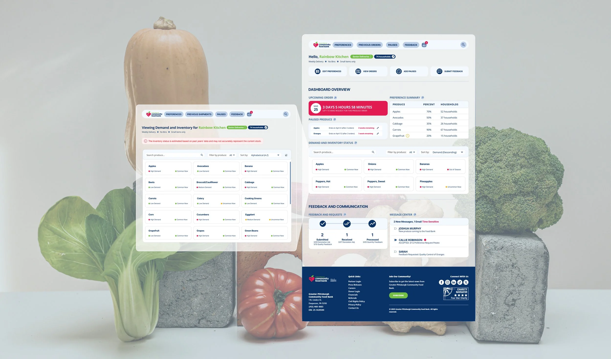
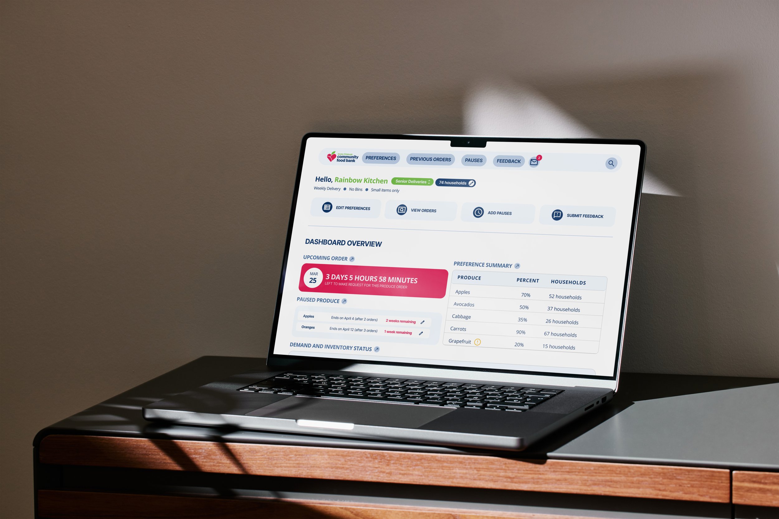
In order to update agency partner’s food preferences, the Pittsburgh Community Food Bank needed to go through a process of emails, phone calls, Salesforce, spreadsheets, and NetSuite. To address this disparate and manually taxing system we built a centralized dashboard to alleviate the manual workload from the Food Bank’s client liaisons.
Role
Visual Design Lead, User Researcher
Duration
Jan-Apr 2025
Tools
Figma, User Interviews, Rapid Prototyping, Presentations
For
Greater Pittsburgh Community Food Bank
With
Lillian Hao
Jin-Ah Jeon
Amira Johnson
Khuslen Misheel
Rafael Rivera
Amanda Gebski (Advisor)
The Greater Pittsburgh Community Food Bank
The Greater Pittsburgh Community Food Bank works with nearly 1000+ partner agencies and programs. They serve 11 counties across Southwestern Pennsylvania and distribute nearly 48M meals each year. Our client representative is Joshua Murphy, the Supply Chain Director at GPCFB. Alongside his team, his goal is to create a streamlined system where agencies can adjust their food preferences and leave feedback for the Advance Choice program in order to better serve people in need.
Our Client
Synthesizing Research into a Seamless Design
The organization currently manages partner agency produce preferences manually via emails, phone calls, spreadsheets, Salesforce, and NetSuite. This process lacks a usable interface for users on both ends and can be both time-consuming and prone to delays or inaccuracies.
I primarily lead the design effort to synthesize our user research into prototypes we continued to refine throughout this project. I combined user testing insights to create something that fulfilled the clients needs, and proactively created features in anticipation for the future.
My Role
The Problem
An inefficient system that causes unnecessary stress and complaints
Discovery
Initial hypothesis: agencies don’t understand the preference system
The Problem Space
Agencies are Complaining
When we were initially approached by the food bank the problem was as stated: agencies are complaining to the Food Bank about operations, allocations, and the current workflow. Upon digging further the Food Bank found that agencies were not able to get the produce they need/want, and the Food Bank realized that there was an internal struggle to manually stay on top of all agency requests. This was when we were approached to create a system to alleviate some of the workload from the client liaisons.
Project Goals
Reduce manual workload of client liaisons
Reduce agency partner’s complaints
Educate Agency Partners on preference systems
Initial Research Methods
Understanding who, what, how
Before we could start anything, we needed to understand the Food Bank’s complex system. We reached out to different members within the Food Bank and their partner agencies, and formed partnerships that continued for the duration of this project.
Process Research
Fly-on-the-Wall Observation
To understand the systems and workflows currently used by the Food Bank's Advance Choice team, we conducted fly-on-the-wall observations. This allowed us to document the tools and processes involved in managing agency preferences and produce distribution.
Contextual Interviews
Stakeholder Interviews
With the support of our client, we conducted interviews with a range of stakeholders involved in the Advance Choice program. This included technical, sales, and operations staff from the Advance Choice team, as well as agency representatives who receive Advance Choice packages.
Field Research
Agency Visits
While visiting, we discussed how agencies process Advance Choice deliveries, unpacking, and distribution to the households they serve. We were able to see and hear various pain points of firsthand.
Domain Research
Competitive Analysis
We analyzed our client’s website alongside others in the food distribution space, including 412 Food Rescue, Greater Chicago Food Depository, and Philabundance. Our analysis focused on identifying key user groups, core interactions, and essential features.
Findings Reject the Initial hypothesis
Guiding Principles
Keep Everyone in the Loop
Overall, we realized that the client-identified issue of agencies not understanding how the preference system worked was a symptom of the primary problem, not the problem itself. After discovering the core of the conflict between the Food Bank and the agencies it served, we selected three key values to prioritize in our ideation and prototyping: transparency, autonomy, and feedback.
New Problem Space
No one Feels Heard
As we dug deeper through our initial research we quickly realized the problem was underscored by compounding problems. Because the Food Bank was overwhelmed trying to keep up with requests there was a lack of consistency in how food was distributed, and this lack of consistency was in part due to the lack of transparency in certain processes preventing agency partners from fully understanding how the Food Bank operates. This culminated into the main issue: People do not feel heard.
New Project Goals
Reduce manual workload of client liaisons
Reduce agency partner’s complaints -> Streamline existing feedback processes
Educate Agency Partners on preference systems -> Promote transparency and autonomy in processes
User Journey Re-Mapped
The glaring problems
Too many ways to reach out
This makes it easy for information to be misplaced or accidentally stay unaddressed.
Transparency: Prioritize One
Make it clear to agencies which is the preferred method of communication, trying to cater to all has made communication nothing to anyone.
Constant back and forth
Sometimes agency partners make requests that aren’t possible within the system, forcing a back and forth conversation with the client liaisons.
Autonomy: Agency Education
Help agencies understand what and how changes are being made. The solution to mitigate to eliminate the need for the back and forth.
Extremely manual process
Updating denotations is not a difficult task, but a tedious one that is prone to human-error.
Autonomy: Necessary Automation
Identify areas along the user journey that can be automated, skipped, or be better for agency partners to take on,
No formal way of responding to feedback
There’s a lack of consistency in how, and when, feedback is addressed if at all.
Feedback: Regular Updates
For every piece of feedback the Food Bank receives, they must in turn provide a piece of counter-feedback.
Define
Ideation
Exploring a range of ideas
Exploration
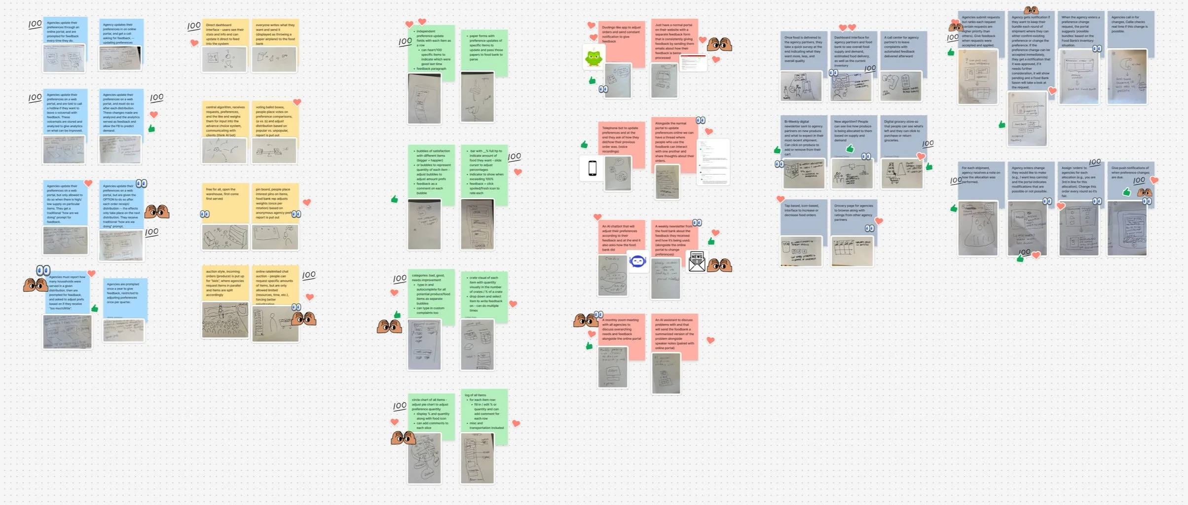
Rapid Idea Exploration– Crazy 8s
Each team member sketched eight ideas in eight minutes to encourage divergent thinking and fast iteration. We focused our crazy 8 efforts around the ideas of transparency, autonomy, and feedback.
Narrowing
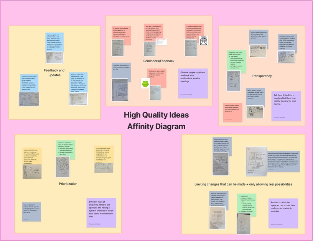
Affinity Diagramming
We voted for the most compelling ideas, and then clustered similar ideas into themes using affinity diagramming, helping us make sense of the patterns and groupings across all our brainstorms.
Choosing
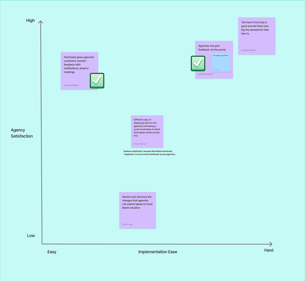
Risk Matrix
We balanced ideas between two scales: agency satisfaction, and ease of implementation. We chose two ideas with different levels of implementation ease.
Efficiency
How might we reduce the amount of time spent doing what is considered to be an extraneous task?
Active Time: The amount of time the user is actively engaging with the process
New Metric
The most important metric
At the end of the day, visiting the dashboard is not part of the agency partner’s usual routine. They are logging on because something needs to be addressed or fixed. We realized through this round of user testing that our biggest job is to reduce the amount of time they need to spend on addressing their concern.
We split the common themes relating to efficiency that came up during our user testing sessions, and let that guide our next round of prototyping.
Waiting Time: The amount of time the user is waiting for the next step of the process. Can be perceived as wasted time, or as thinking time to more thoughtfully process their request
Menial Active Work: The amount of repetitive active work the user is engaging with, especially when it’s information they feel the Food Bank should already know.
Transparency
Exacerbated
Although agency partners could now get more information, the fact that it was a robot and not a person made them question the legitimacy of it.
Autonomy
Improved
Agency partners could now make changes anytime, regardless of schedule.
Too many steps to make a simple change
Between each of the steps the agency partner needs to wait for confirmation before they can move to the next step.
Feedback
Improved
It was easy to make adjustments, and there would be text confirmations about the status of their feedback after their submission.
Unsure of task fulfillment
Because everything takes place through a text or voice platform, the lack of a visual confirmation made partner agencies unsure whether their changes actually went through.
Findings
How long a task takes matters more than when they take place
In the original model where partner agencies had to call the Food Bank within a designated window of time, meant that two people’s schedules needed to match up before a change could be made. Here we explored what happens when we remove the variable of another’s schedule, and be able to make changes any time.
Although this prototype sped up processes by reducing the need for the back and forth, felt longer than the previous process because of the pauses in the conversation while the bot was confirming things in the back end. We recognized here that time, or rather perceived time, is the most important factor for agency partners.
“I want a quick and simple way to do what we need. I’m waiting too long right now.”
Prototype 1 Metrics
Improved, but exacerbated time to complete task
We improved on two fronts: autonomy and feedback, but transparency was largely maintained/exacerbated. We also began to recognize that beyond these goals that we had, agency partners were much more concerned about another: Efficiency, or at the very least, the perception of it.
Prototype 1
ChatBot: Leveraging a more familiar system
Pros: The food bank already takes in requests via phone, this would have a lower barrier to learning and more approachable for less tech-savvy users,
Cons: Users can’t see the full picture of their preferences or feedback at once, and adjusting multiple preferences is cumbersome. People may be adverse to speaking to chat bot rather than person, especially when handling more novel requests.
Efficiency
Maintained
Although time to task completion is about the same, there is a perception that the process takes longer now because of more wait time.
“This is nice, I have too many different platforms doing too many
different tasks.”
Transparency
Improved
Agency partners now have multiple touchpoints to understand how their denotations come together.
Autonomy
Improved
Agency partners could now make changes anytime, regardless of schedule.
Feedback
Improved
There are trackers to see what stage their feedback has reached with the Food Bank.
Space to centralize all information
Rather than digging through email chains, agency partners expressed relief at being able to see all communication in one place. They processed one item at a time and did not express being overwhelmed by the quantity.
Need to surface key features
For most users they will not be browsing the dashboard to see the inventory status, they would only open the dashboard to fulfill one of three or four tasks. If new features interrupt the completion speed of these tasks, overall satisfaction will drop.
Findings
One central area for all information to live
Agencies found the information hierarchies and presentation of data to be helpful and clear, citing the current lack of data clarity. They did not seem to be overwhelmed with the information, processing items one at a time, presumably due to existing experience with the food bank and its systems.
The expected barrier of understanding for new and existing users seemed to be less significant than initially expected.
Prototype 2 Metrics
Improved, but missing a forth metric: efficiency
We improved on all fronts that we had originally set, so we decided to move forward with this prototype. This prototype allowed for clearer navigation, better visibility into key data, and a more consistent user experience within the same platform the Food Bank already uses. However we realized through this stage of user testing that “efficiency” matters the most to agency partners so we still needed to explore solutions to improve that front.
We also needed to be cognizant of the key value proposition of this dashboard, so that this does not become yet another platform that agency partners have to use to communicate with the Food Bank.
Prototype 2
Dashboard: One stop shop for all food bank interactions
Pros: Necessary information and data visualizations visible at once, visual controls are more intuitive, and can be built through Salesforce
Cons: Will require on-boarding, new agencies may find information density intimidating, and if the Food Bank is not able to connect it with their current platform then it further disconnects and becomes yet another platform the Food Bank operates from.
Efficiency
Maintained
Time to completion is about the same, to encourage use of this platform efficiency will be our greatest value proposition.
Develop
Deliver
Timely notifications to get you food as soon as you need it
Start planning for your meal before the first pangs of hunger set in. Set timely reminders on your phone to remind you of your recent grocery trip contents and any reminders to pick up ingredients after work.
Key Feature 1
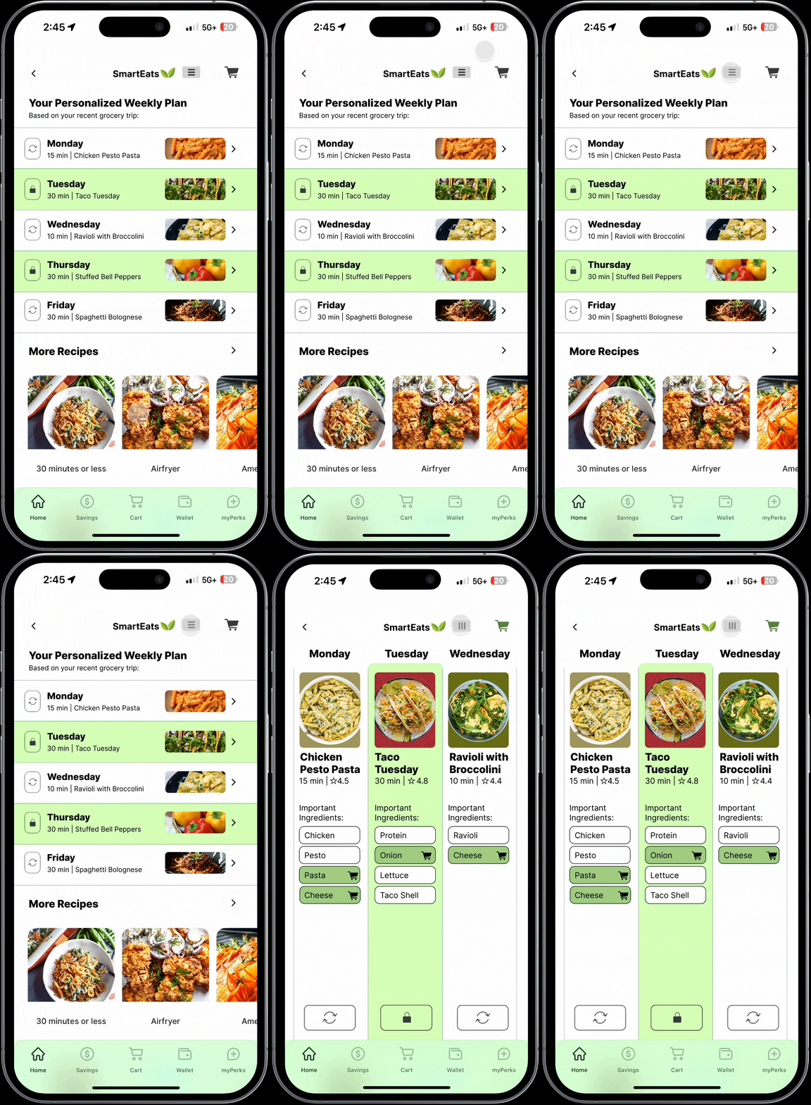
Creating a personalized weekly meal plan
for you
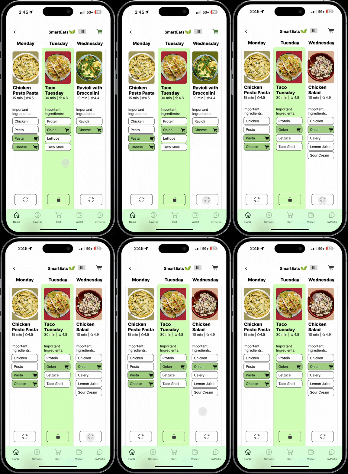
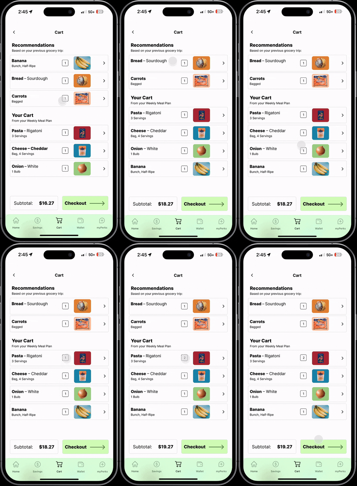
Lock in your favorite recipes and quickly see what ingredients you are missing and immediately add them to your cart.
Key Feature 2
Meals tailored to your tastes
Get recipe recommendations based on what you have purchased in the past. Keep swapping out recipes until you find one you like, and works with your current pantry.
Key Feature 3
Nudging your weekly shops
Get reminders for the ingredients you love, but buy infrequently or in bulk. Never forget you bananas again.
Key Feature 4
What brings customers to Giant Eagle?
Given Giant Eagle’s interest in creating a meal solution, we were interested in exploring how to increase more little shops and how to integrate Giant Eagle within the daily meal decision experience. We set out to the storefronts to interview shoppers and study the landscape+do conduct further research to understand Giant Eagle’s position within the food delivery market.
Research
Understanding the value proposition of
Giant Eagle
We created a persona based off of what we thought the ideal target audience would be, and we chose the parent of a family because they’re going to be the most likely to not have time or the energy to worry about what they should eat until the last minute, while also being likely to want to save money.
Consolidating the Research
Understanding how the service fits together
Since Giant Eagle wants to increase engagement with their app, we mapped out the current user journey of purchasing groceries. This way it was easier for us to visualize both when and where different interventions can take place.
Creating a Service Blueprint
Creating a meal service for busy families
We created a persona based off of what we thought the ideal target audience would be, and we chose the parent of a family because they’re going to be the most likely to not have time or the energy to worry about what they should eat until the last minute, while also being likely to want to save money.
Defining a Target User Group
A missing ingredient delivery or
Pickup service
Early Iterations
Prioritizing Early Notifications
Timely after work notification system
Based on the service blueprint we recognized that the best time to create an intervention would be during the preparation stage. Since we are targeting families, we decided to test a notification system that would give a recipe recommendation at around 6PM. These recipes would be based on what the customer ordered last time they were in Giant Eagle. Any missing ingredients could be ordered through the Giant Eagle app, and delivered right away.
Recognizing Logistical Constraints
The $35 Fee Challenge
Our proposed business model, realistically, is not profitable enough for Giant Eagle. We were encouraging people to buy the 1-2 missing ingredients to finish complete a recipe, which could cost around $10 to $20, but nowhere near the $35 minimum needed for deliveries and pickup.
