Streamlining processes at Pittsburgh COmmunity Food Bank
User Research, UI Design, UX Design, Service Design
In order to update agency partner’s food preferences, the Pittsburgh Community Food Bank needed to go through a process of emails, phone calls, Salesforce, spreadsheets, and NetSuite. To address this disparate and manually taxing system we built a centralized dashboard to alleviate the manual workload from the Food Bank’s client liaisons.
Role
Visual Design Lead, User Researcher
Duration
Jan-Apr 2025
Tools
Figma, User Interviews, Rapid Prototyping, Presentations
For
Greater Pittsburgh Community Food Bank
With
Lillian Hao
Jin-Ah Jeon
Amira Johnson
Khuslen Misheel
Rafael Rivera
Amanda Gebski (Advisor)

Our Client
The Greater Pittsburgh Community Food Bank
The Greater Pittsburgh Community Food Bank works with nearly 1000+ partner agencies and programs. They serve 11 counties across Southwestern Pennsylvania and distribute nearly 48M meals each year. Our client representative is Joshua Murphy, the Supply Chain Director at GPCFB. Alongside his team, his goal is to create a streamlined system where agencies can adjust their food preferences and leave feedback for the Advance Choice program in order to better serve people in need.
Problem Space
Reduce the manual workload of client liaisons
The Program
Advance Choice Program provides fresh produce across the region
Advance Choice is a program that was piloted in 2015. The program provides free produce to agencies and allows them to specify their preferences for these produce items for upcoming distributions. Its growth has allowed fresh produce to become over 50% of the product mix in 2024. Advance Choice is unique because it allows a level of flexibility that no other program offers, allowing agencies to better accommodate the different needs of their communities.
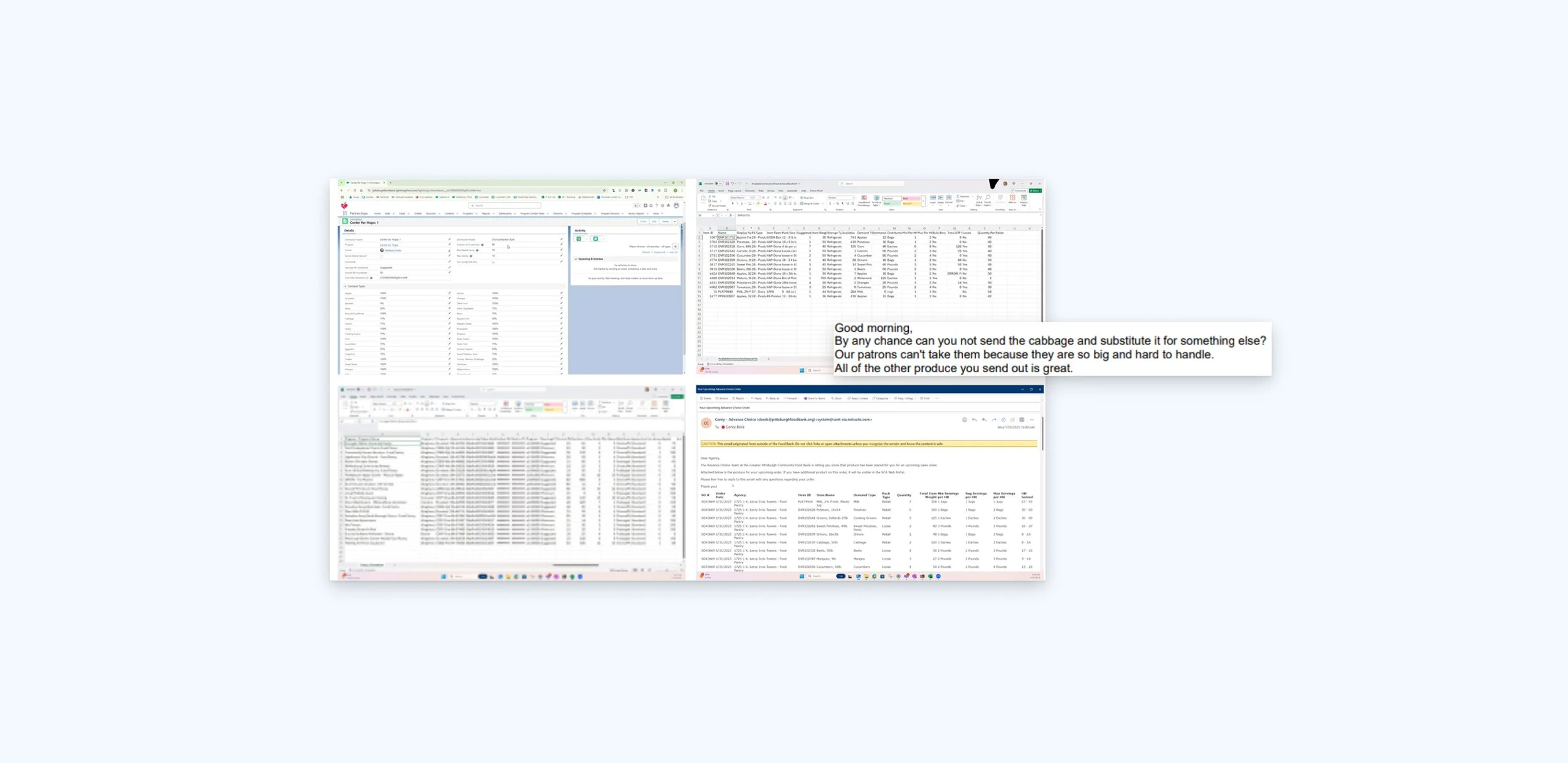
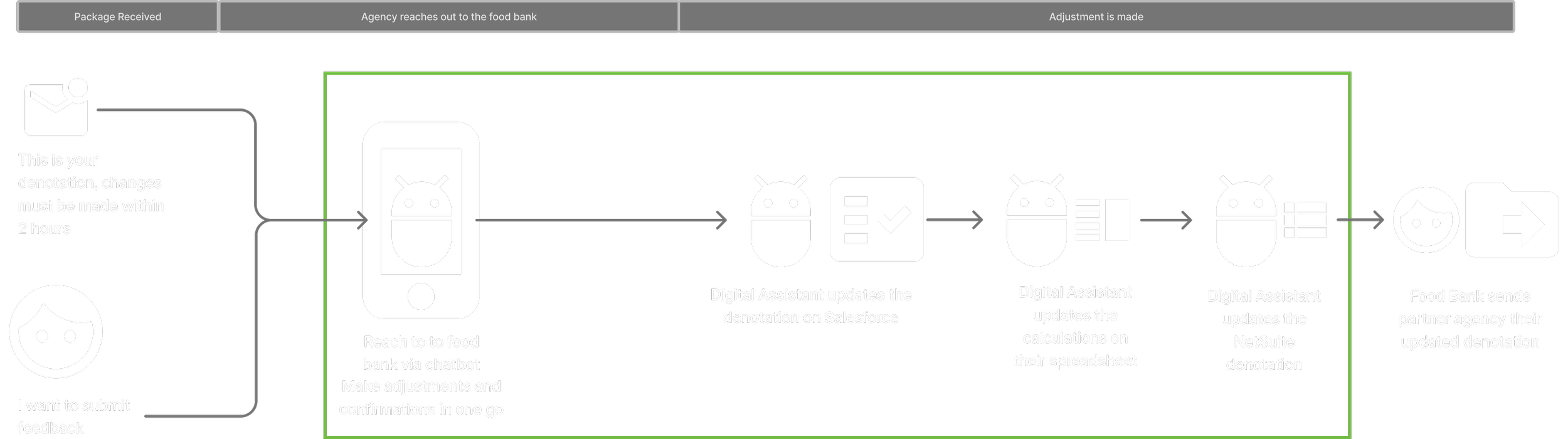
The organization currently manages partner agencies’ produce preferences manually via emails, phone calls, and spreadsheets. These spreadsheets are then uploaded by an agency liaison into the CRM software Salesforce and are used to create and process orders in NetSuite. This process lacks a usable interface for users on both ends and can be both time-consuming and prone to delays or inaccuracies. The client wishes to automate this process by first clarifying the meaning of preferences to agencies and, secondly, working to optimize their manual workload.
Proposed Solution
A centralized dashboard providing transparency and streamlined processes


Initial hypothesis: agencies don’t understand the preference system

Starting Point
A Very Manual Process
The Food Bank’s system for tracking and delivering orders was a network of legacy and new systems blended together with different people owning each part of the system.
A lot of what we assumed would be automated ended up being someone’s daily manual task. This meant every request an agency partner put through the system disproportionately added work on the Food Banks’s side.

Step 1: Salesforce
Project Goals
Reduce manual workload of client liaisons
Reduce agency partner’s complaints
Educate Agency Partners on preference systems

Step 0: Communication from the Partner Agency
Step 2: Excel Spreadsheet

Step 3: Netsuite
Initial Research Methods
Understanding who, what, how
Research Summary
Observations and domain research
With the support of our client, we conducted interviews with a range of stakeholders involved in the Advance Choice program. This included technical, sales, and operations staff from the Advance Choice team, as well as agency representatives who receive Advance Choice packages.


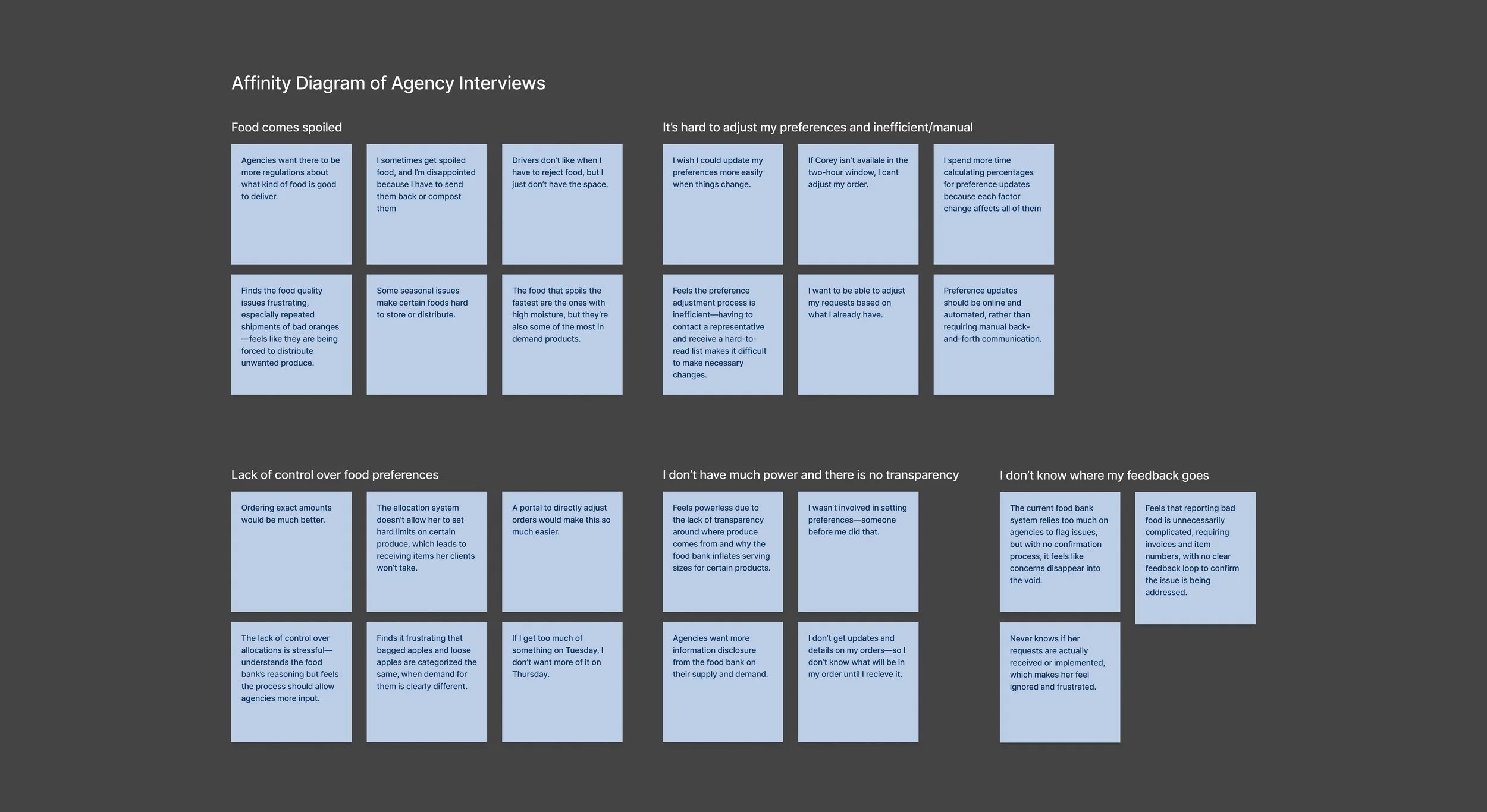
Too many ways to reach out
This makes it easy for information to be misplaced or accidentally stay unaddressed.
Constant back and forth
Sometimes agency partners make requests that aren’t possible within the system, forcing a back and forth conversation to clarify.
Extremely manual process
Updating denotations is not a difficult task, but a rather tedious one that is prone to human-error.
No formal way of responding to feedback
There’s a lack of consistency in how, and when, feedback is addressed if at all.
User Journey
Opportunity spaces within the user journey
By combining the interviews of Food Bank employees and partner agencies, we identified four key areas of opportunities.
Prioritize One
Make it clear to agencies which is the preferred method of communication, trying to cater to all has made communication nothing to anyone.
Agency Education
Help agencies understand what and how changes are being made. The solution to mitigate to eliminate the need for the back and forth.
Necessary Automation
Identify areas along the user journey that can be automated, skipped, or be better for agency partners to take on,
Regular Updates
For every piece of feedback the Food Bank receives, they must in turn provide a piece of counter-feedback.


Culminating Problems
Uncovering deeper issues
After synthesizing our research we realized to solve the challenge of partner agency complaints the solution would need to go beyond our original scope.
We agreed to continue our research with a new north star: Helping people feel heard.
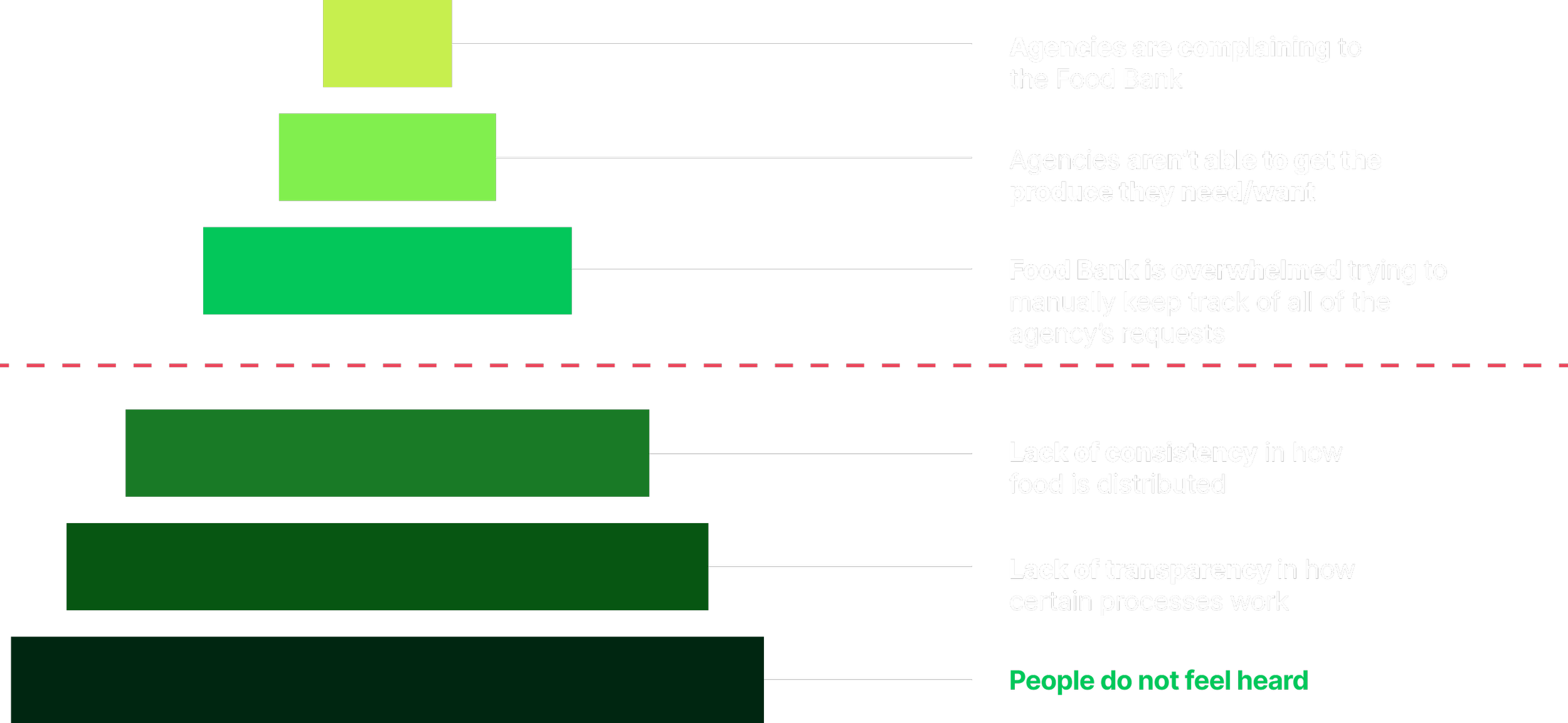
North Star
How might we help people feel heard
New hypothesis: agencies know the system but want to know why
New Project Goals
Reduce manual workload of client liaisons
Introduce more transparency into the preference system

Transparency
Exacerbated
Although agency partners could now get more information, the fact that it was a robot and not a person made them question the legitimacy of it.
Autonomy
Improved
Agency partners could now make changes anytime, regardless of schedule.
Feedback
Improved
It was easy to make adjustments, and there would be text confirmations about the status of their feedback after their submission.
Findings
How long a task takes matters more than when they take place
In the original model where partner agencies had to call the Food Bank within a designated window of time, meant that two people’s schedules needed to match up before a change could be made. Here we explored what happens when we remove the variable of another’s schedule, and be able to make changes any time.
Although this prototype sped up processes by reducing the need for the back and forth, felt longer than the previous process because of the pauses in the conversation while the bot was confirming things in the back end. We recognized here that time, or rather perceived time, is the most important factor for agency partners.
Assessment
Improved, but exacerbated time to complete task
We improved on two fronts: autonomy and feedback, but transparency was largely maintained/exacerbated. We also began to recognize that beyond these goals that we had, agency partners were much more concerned about another: Efficiency, or at the very least, the perception of it.
Prototype 1
ChatBot: Leveraging a more familiar system
Efficiency
Exacerbated
Although time to task completion is about the same, there is a perception that the process takes longer now because of more wait time.
Is familiarity better?
Partner agencies already call-in their requests, and were quick to pick up on how system works.
Are people OK with dealing with an digital agent?
Limitations of digital agent meant there was more waiting time, which was disliked.
Are people confident their request has been heard?
People expressed hesitation toward the digital agent.

Transparency
Improved
Agency partners now have multiple touchpoints to understand how their denotations come together.
Will people actually use a new system?
Need more time for assessment, need to study to see what the key value proposition is.
Autonomy
Improved
Agency partners could now make changes anytime, regardless of schedule.
Feedback
Improved
There are trackers to see what stage their feedback has reached with the Food Bank.
How mobile does solution want to be?
This factor seems more like a nice to have. Since their work takes place at a desk regardless, this didn’t seem to be too important
Findings
One central area for all information to live
Agencies found the information hierarchies and presentation of data to be helpful and clear, citing the current lack of data clarity. They did not seem to be overwhelmed with the information, processing items one at a time, presumably due to existing experience with the food bank and its systems.
The expected barrier of understanding for new and existing users seemed to be less significant than initially expected.
Assessment
Improved, but needs greater efficiency
We improved on all fronts that we had originally set, so we decided to move forward with this prototype. This prototype allowed for clearer navigation, better visibility into key data, and a more consistent user experience within the same platform the Food Bank already uses. However we realized through this stage of user testing that “efficiency” matters the most to agency partners so we still needed to explore solutions to improve that front.
We also needed to be cognizant of the key value proposition of this dashboard, so that this does not become yet another platform that agency partners have to use to communicate with the Food Bank.
Prototype 2
Dashboard: One stop shop for all food bank interactions

Efficiency
Maintained
Time to completion is about the same, to encourage use of this platform efficiency will be our greatest value proposition.
Is a new, but more convenient system better? Liked
One centralized location promotes both autonomy and convenience.
Chosen Concept
Perceived efficiency is the most important factor
Although the dashboard does not yet improve efficiency, we chose the concept for its potential to further improve.
We split the common themes relating to efficiency that came up during our user testing sessions, and let that guide our next round of prototyping.
Chatbot

Maintained
Time to completion is about the same, to encourage use of this platform efficiency will be our greatest value proposition.

Exacerbated
Although time to task completion is about the same, there is a perception that the process takes longer now because of more wait time.
Dashboard
Design Iterations
Testing ways to Maximize EFFICIENCY and transparency
To get buy-in from the Food Bank and the Agency Partners, we knew the system needed to be more efficient than what they are using now. Additionally we needed to balance between the Food Bank and Agency Partners to figure out how to best increase transparency throughout the processes
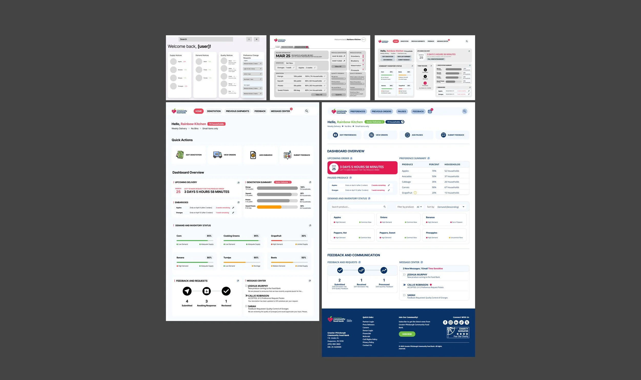
Dashboard
Streamlining established work processes
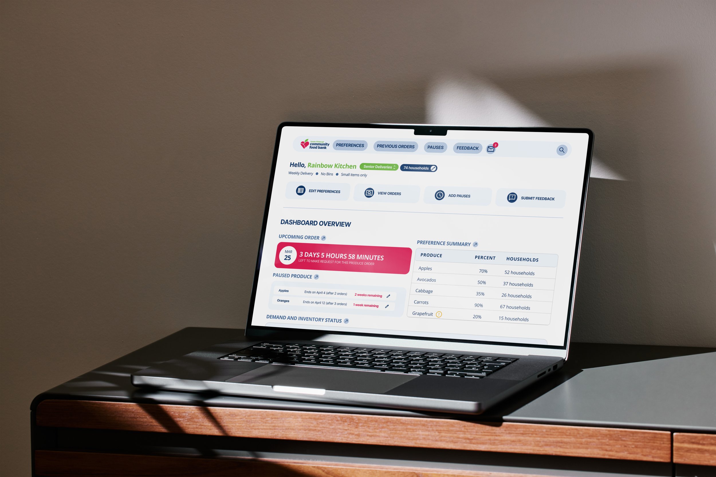
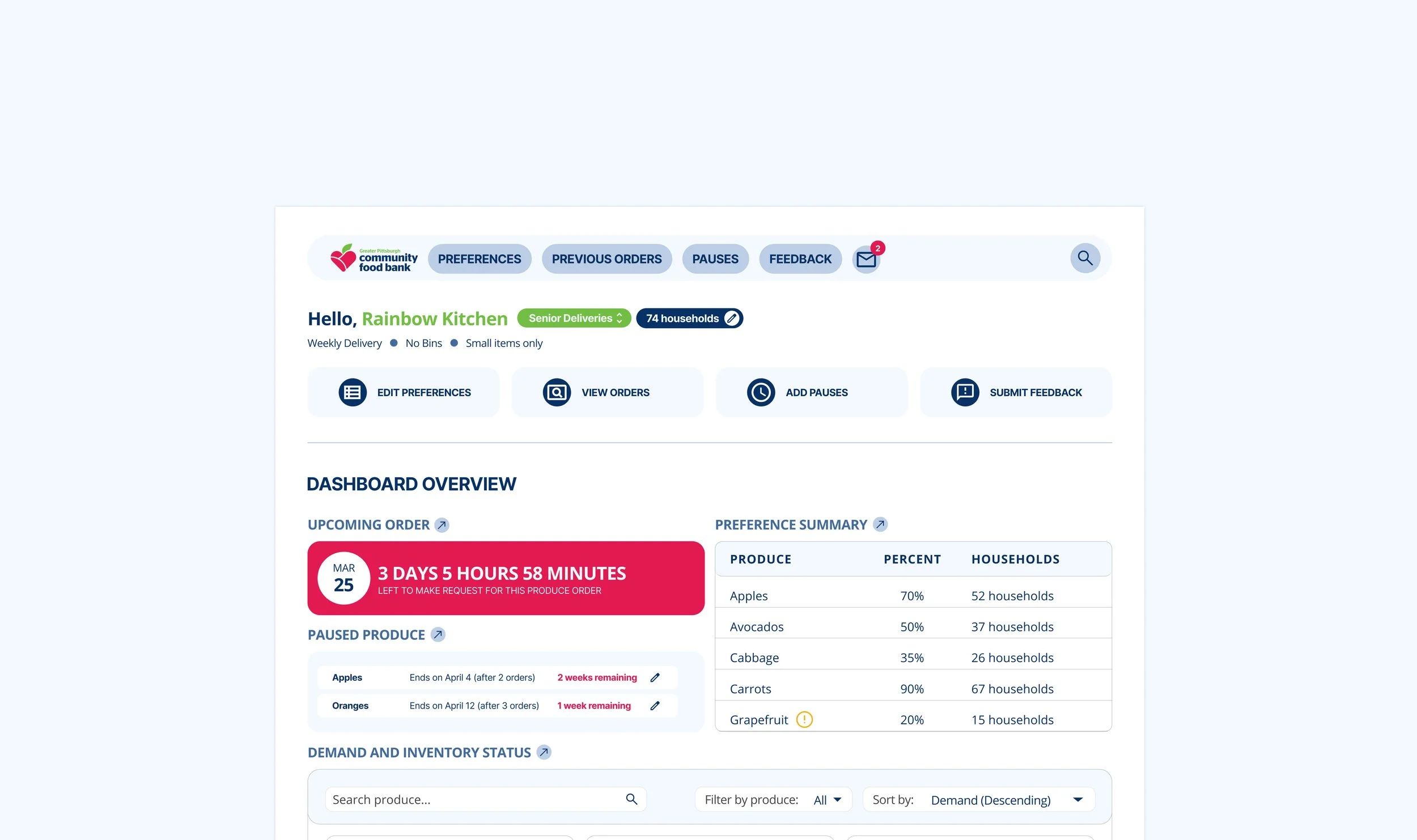
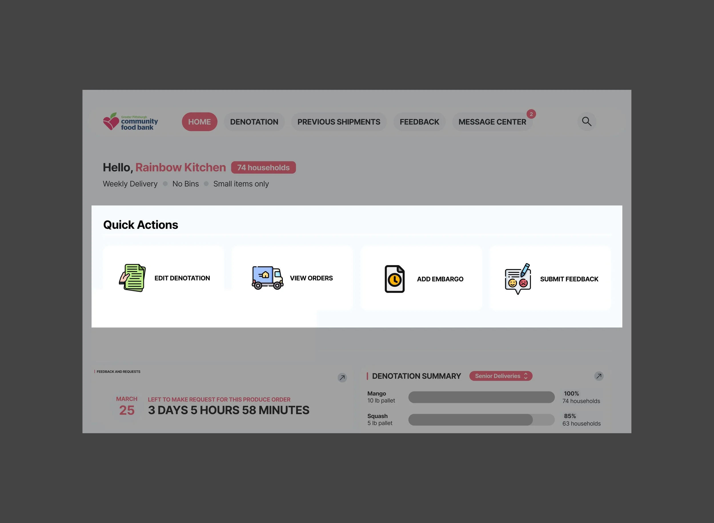
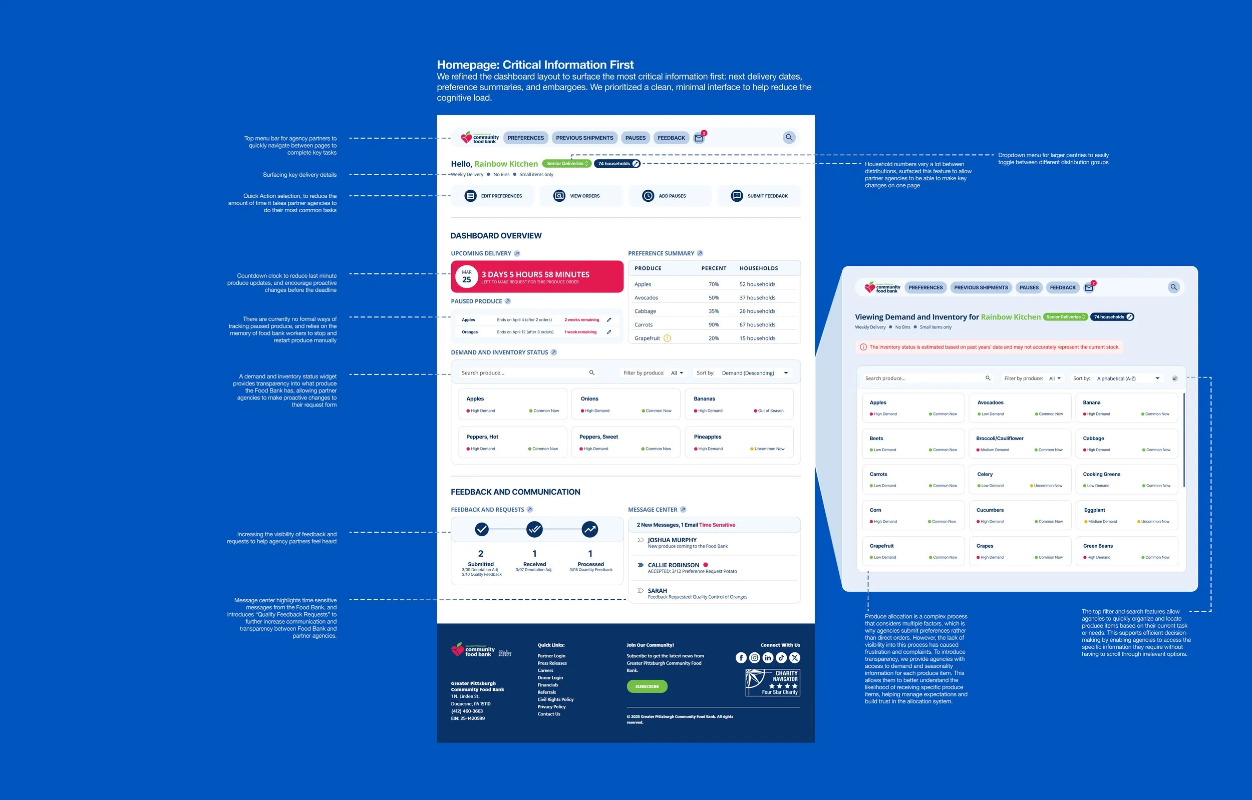
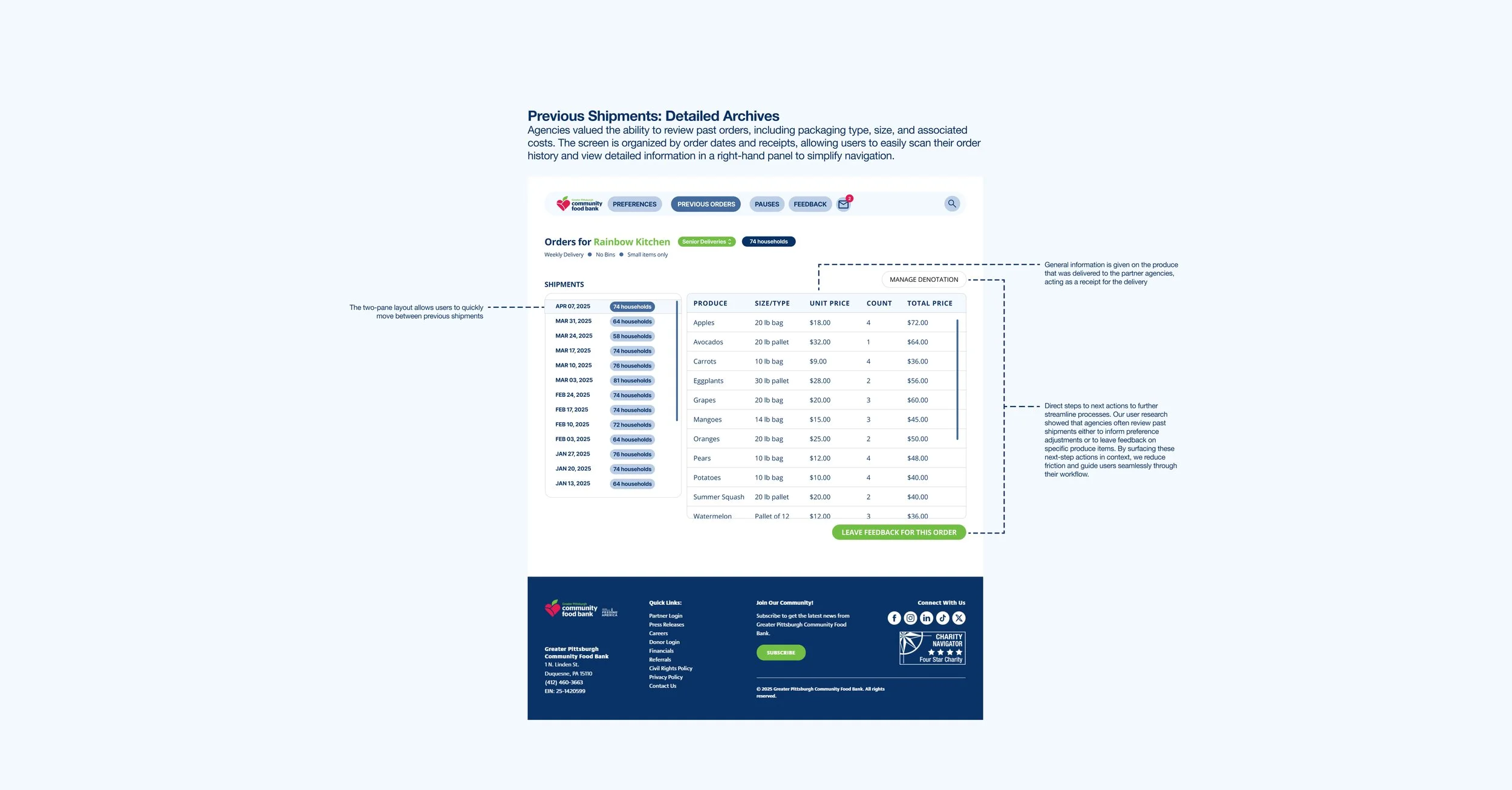
Based on our previous research the amount of time spent on a task is the most important indicator for agency partners. In further interviews we asked which functions were used the most often to determine which features would be the most valuable to surface at the top of the page. These quick action buttons would link straight to the desired form, reducing the number of clicks required to do these actions.
The following four were chosen: Edit Denotation, View Orders, Add Embargo, and Submit Feedback.
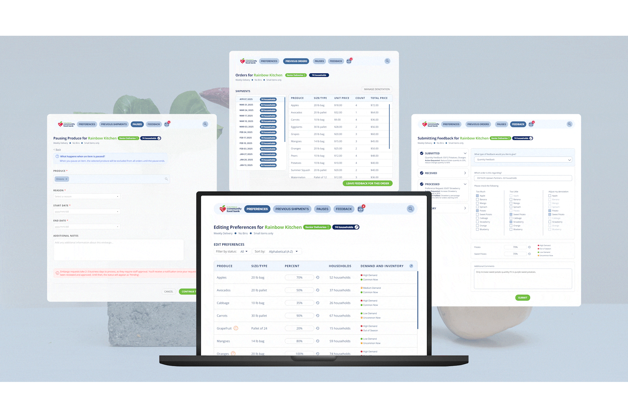
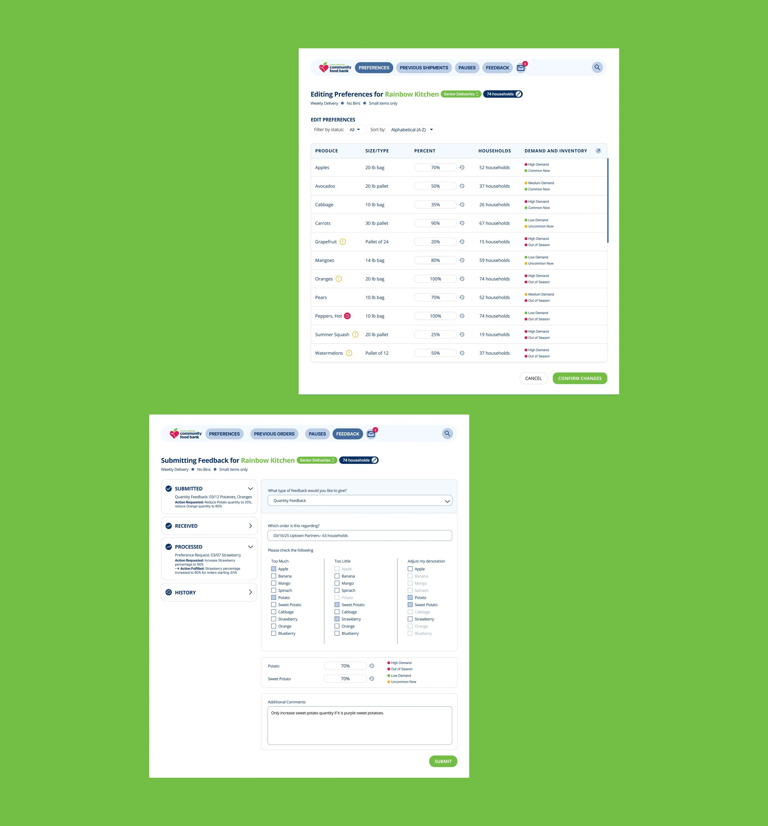
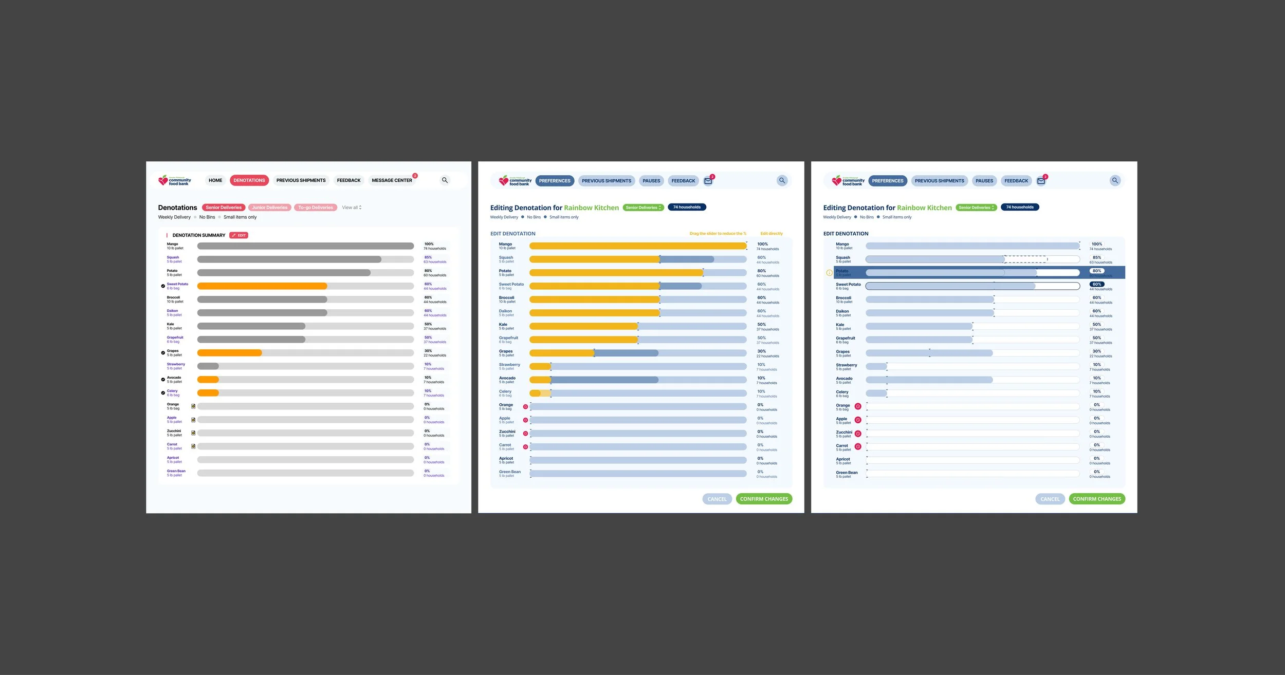
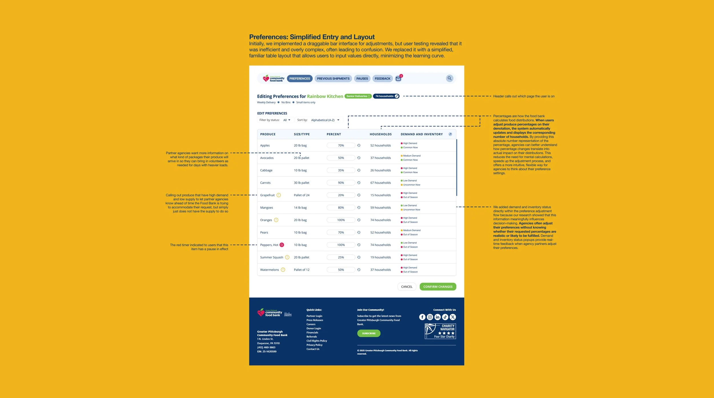
Edit Denotations
Actionable preference updates
The percentage-based sliders were intuitive to most users, and feedback confirmed that they appreciated the flexibility to adjust allocations without needing to reach 100%. To further reduce friction, we incorporated visual explanations and future guidance on how adjustments impact deliveries.
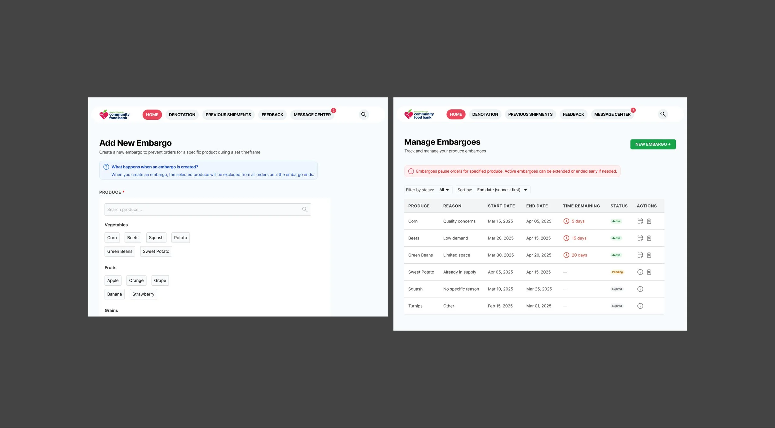
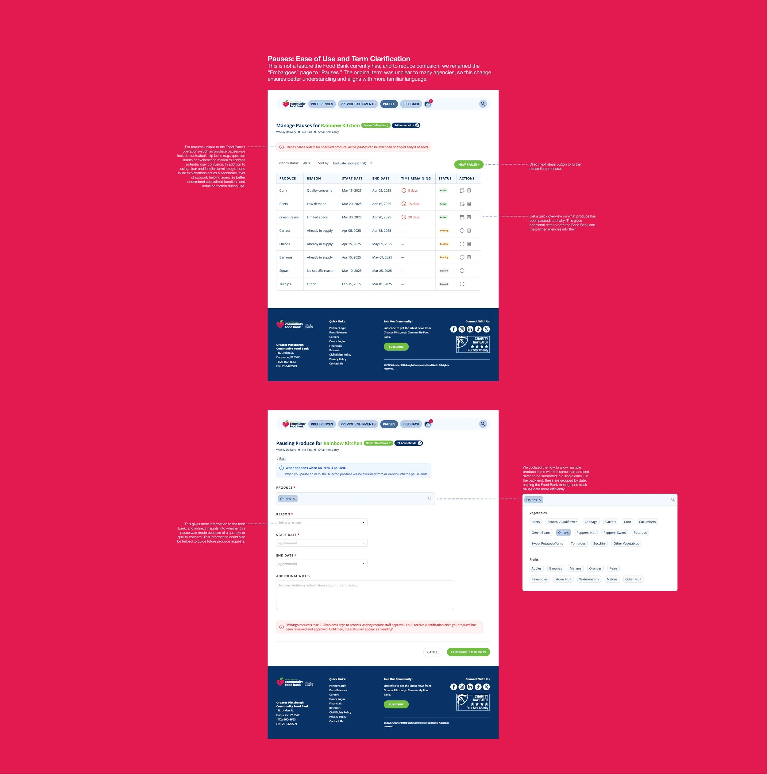
Pauses
Setting your own pauses
We noted through interviews with the food bank that right now there are no official ways of setting a pause in the produce. This function creates an official channel of creating pauses, while still keeping the Food Bank in the loop by giving them the final say in whether or not to pause produce items.
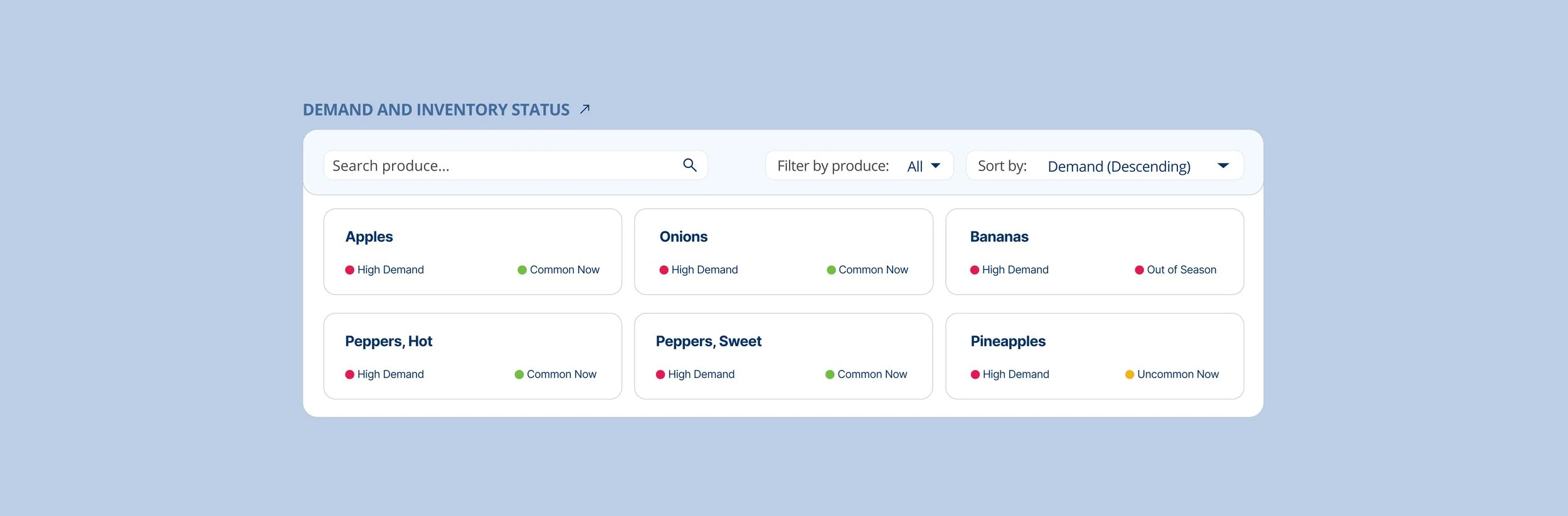
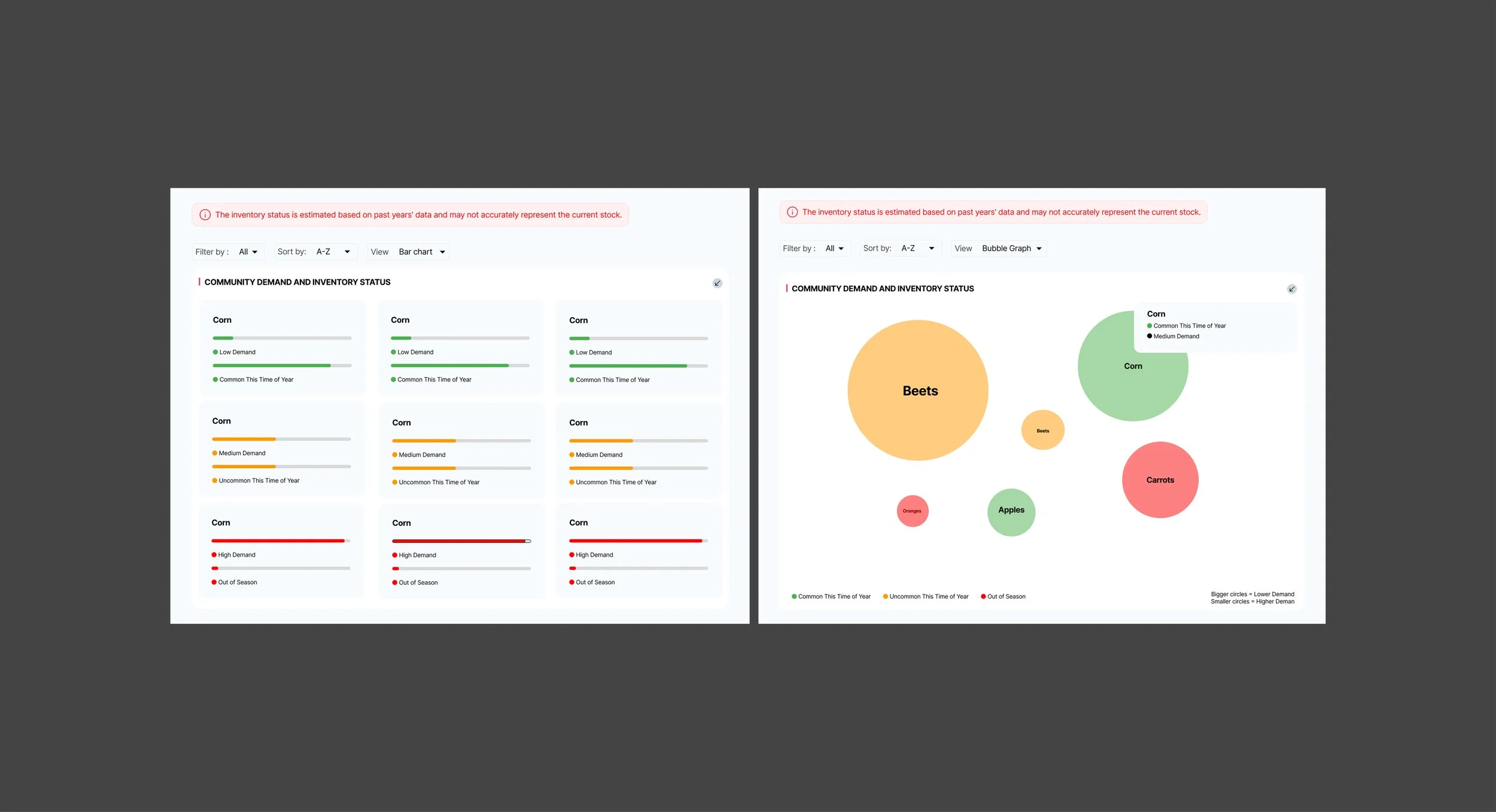
Inventory
Visualizing inventory and distribution
A dual-visualization approach was introduced for demand and inventory status—users could toggle between a bar chart and a bubble chart, depending on preference and comprehension.
We incorporated color-coded indicators (green = available, red = out of stock) and began testing how well users understood them in the context of preference and demand.
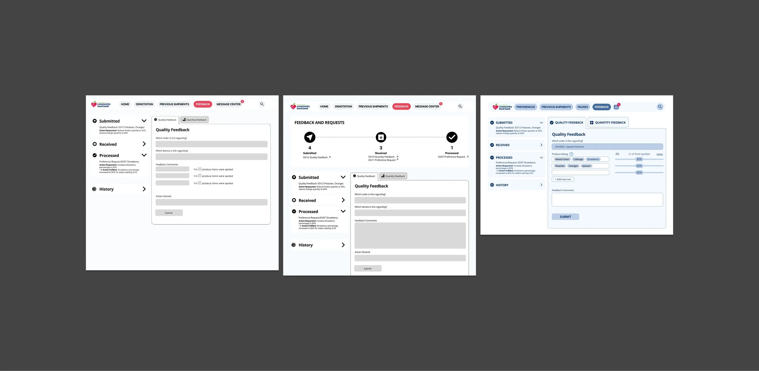
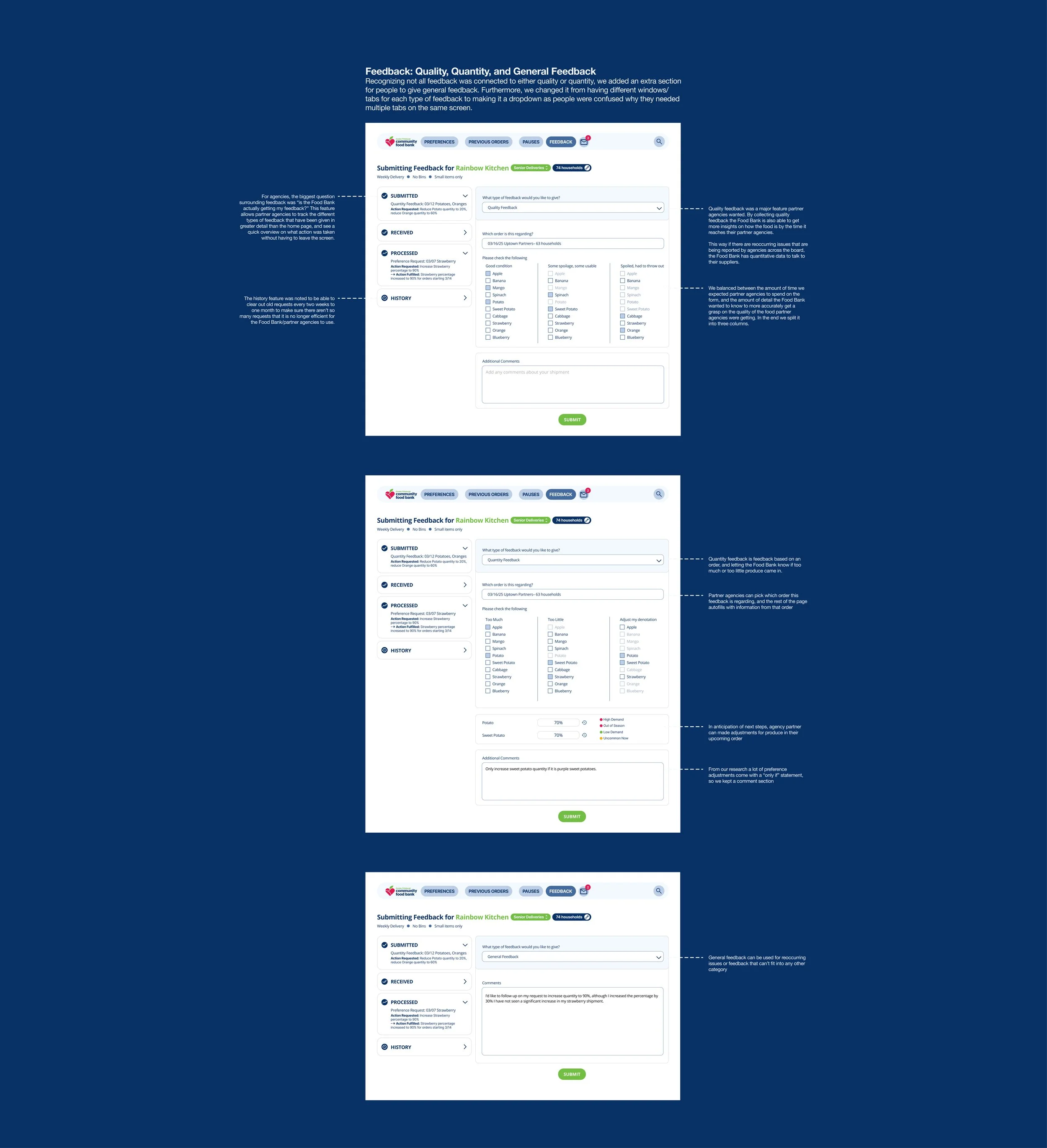
Feedback
Shorter feedback response
We restructured the feedback workflow to allow low-effort, targeted responses (e.g., only provide feedback on poor items, skip what was fine).
We also visualized a tracker on the side for agency partners to easily see where in the process their feedback has gone, helping them stay in the loop.
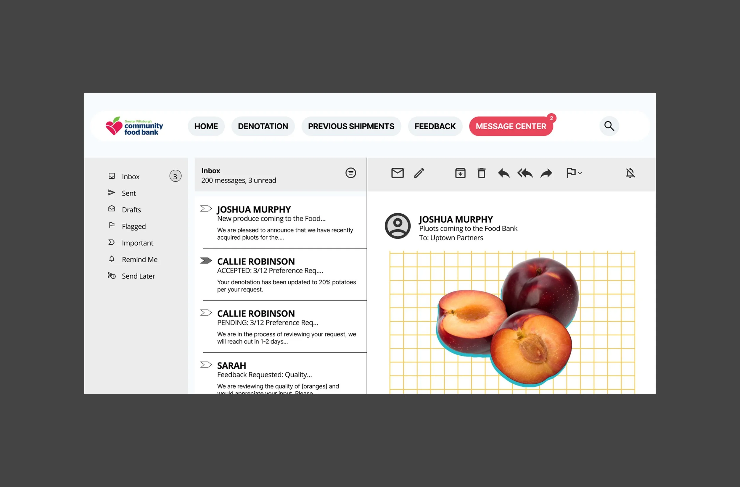
Email blasts for more types of content
Now that all information is central to one location, the food bank can rethink the way the message center is being used. The message center can highlight new produce coming to the Food Bank, formal updates to preference requests, and requests for feedback to left for certain produce items.
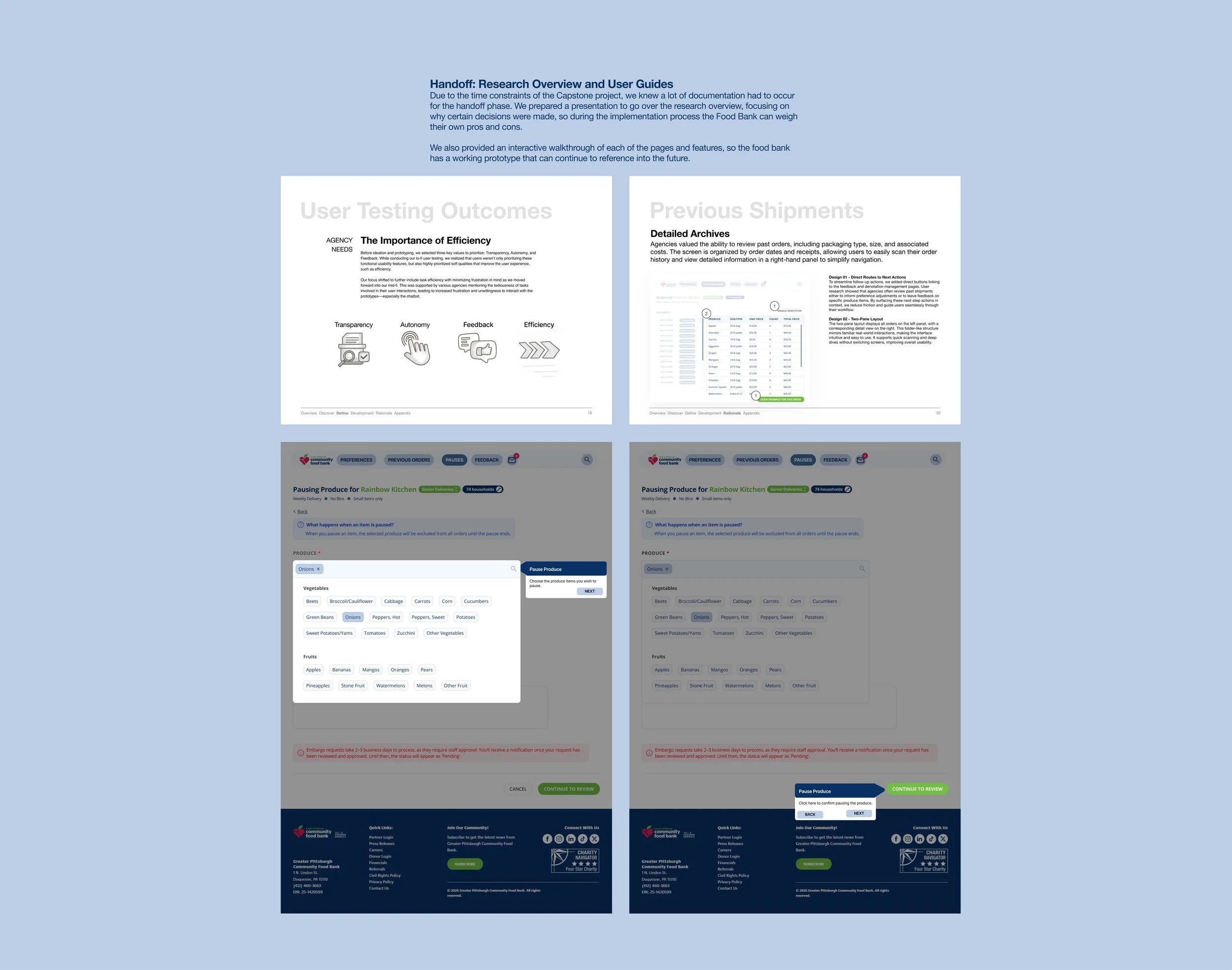
Final Design
A streamlined platform for all
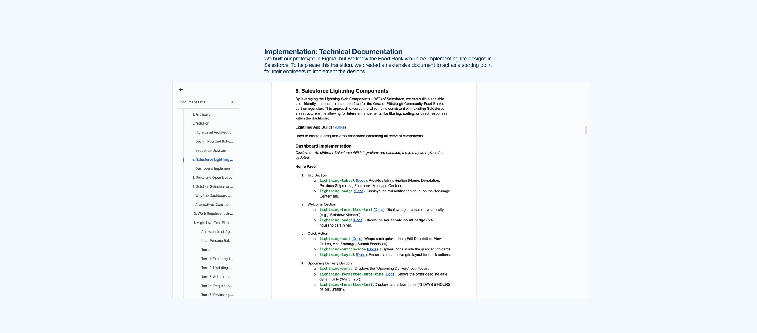
We heavily prioritized efficiency of use within the platform, and worked with the Food Bank to make sure their verbage was used throughout. The final deliverable also included an implementation guide to mitigate some of the complexity between design and development.
Final Reflections
Set your intentions for each phase of testing
We were a larger team this time, which meant we had the ability to divvy up the work between members. This also meant, that a lot more conversation and documentation needed to occur to make sure the tests aligned with the prototypes that were created.
Always talk with both the client and their customers
This project started with the Food Bank coming to us with the concern that their customers, the agency partners, were complaining. Although their initial assumption of why is right, it was only a secondary (if not tertiary) concern from the partner agencies. We are grateful to the Food Bank for listening to our concerns, and agree to pivot from the original scope of the project.
To the Food Bank & everyone that we spoke to
To everyone that we worked with at the Food Bank, and to all the partner agencies that we’ve talked to (and especially those that opened their doors to us) we are grateful for your time and genuine dedication to help us improve this project.
To our advisor, who supported us and pushed us
To Amanda for supporting us throughout the project pivot. Your feedback really helped us push this project forward. Additionally, your dedication to give us critical feedback allowed us to raise the bar and create something even better.
Acknowledgements
To all the hard work
To the Food4U team, we came from the beginning of trying to decipher to complex process of denotation adjustments all the way to identifying key pain points, and to finding additional opportunities for improvement. This was a long project, and I’m impressed to see how everyone’s skillset came together to make this project come to life.